You've got a post ready to share to Stories. The content is good. The default Instagram gradient is not. It clashes with your brand, makes your text harder to read, and turns a polished asset into something that looks rushed.
That's usually when people realize changing background color of instagram story isn't a cosmetic trick. It's part of presentation. If you post often, especially across multiple accounts, the fastest background method and the most brand-accurate method are rarely the same. Knowing which one to use saves time and keeps your Stories looking intentional.
Why Your Story Background Is More Than Just a Color
A bad Story background does two things fast. It weakens recognition, and it distracts from the actual message. If you're sharing a Reel, a product update, a CTA, or a simple poll, the background should support the content, not compete with it.
That matters more than most creators think. According to recent data analysis from 2026, 70% of Instagram users opt to change their story background colors using Instagram's built-in in-app tools (Closo). That tells you two things. First, most users already care enough to override the default look. Second, native tools are usually fast enough to become part of a real workflow.
What a good background actually does
A strong Story background helps with:
- Readability: Text, stickers, and link prompts stand out faster.
- Brand recall: Repeating the same color family makes your Stories recognizable.
- Visual hierarchy: A muted background can push attention to the right element.
- Cleaner reposts: Shared feed posts and Reels look less random when framed properly.
Practical rule: If the background draws more attention than the message, it's doing the wrong job.
This is also where process matters. Teams that publish often usually need repeatable systems, not one-off design hacks. That's why resources on scalable Instagram Story background workflows are useful. They help you think in terms of repeatable choices, not just isolated edits.
If you're building a broader brand system, your Stories should match the rest of your presence. That's the same logic behind a consistent profile, feed, and content voice, which is why this guide on building a social media presence is worth pairing with your Story workflow.
The 10-Second Fix for Text-Only Stories
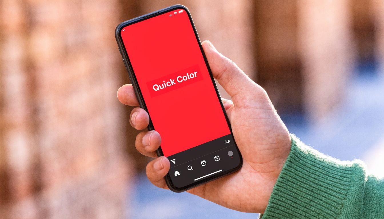
When there's no photo or video involved, Create mode is the fastest option. For quick text updates, poll prompts, countdowns, or link stickers, it's the method I'd train first because it removes friction.
The fastest method for a solid-color background with no photo is using Create mode, taking only 5-10 seconds (Zeely). That's why it works so well for accounts that post frequent updates throughout the day.
How to do it fast
- Open Instagram Stories.
- Tap Create or the Aa option.
- Tap the small color circle to cycle through Instagram's preset backgrounds.
- Add your text, sticker, poll, or link.
- Adjust text color so it stays readable against the selected background.
- Post.
That's it. No importing. No Draw tool. No layer management.
Best use cases for Create mode
Create mode is best when the message is short and the Story needs to go live now.
| Use case | Why Create mode works |
|---|---|
| Quick announcement | You can post almost immediately |
| Poll or question box | Clean background keeps interaction front and center |
| Link sticker | Less visual noise around the CTA |
| Flash update | No need to prep a supporting image |
Where Create mode falls short
The trade-off is control. You get speed, but not much precision. The built-in options are useful, yet they're still presets. If your brand relies on exact colors, Create mode usually gets you close, not exact.
Use Create mode when speed matters more than precision.
It's also not the right fit when you're framing a photo, reposting a post, or trying to match a brand palette exactly. In those cases, the Draw tool gives you more control, even if it takes a bit longer.
Adding a Solid Color Behind Photos and Posts
Many creators hit a wall when they try to share a photo or repost a feed post to Stories. Instagram gives them a background, but not the one they want. That's where the Draw tool fill method becomes the default fix.
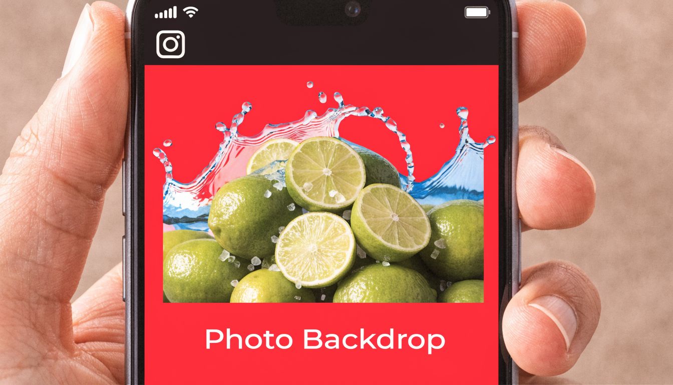
Start with the media first. Add the photo, shared post, or screenshot to your Story. Then open the menu, choose Draw, select the Pen tool, pick a color, and long-press on the screen until Instagram fills the background layer.
That long-press is the part people miss. Tapping just draws on the image. Holding fills the canvas.
The clean way to use the Draw tool
The most reliable workflow looks like this:
- Add your content first: Photo, reposted feed post, or screenshot.
- Open Draw: Tap the menu in the top corner and choose Draw.
- Pick a base color: Start with a palette color for speed.
- Long-press to fill: Hold until the full background changes.
- Resize or reposition content: If needed, shrink the main visual so the background shows around it.
For photos that don't fit the frame cleanly, this is usually the best compromise between speed and control. It gives the image breathing room without forcing a random gradient behind it.
The mistake that confuses most people
Sometimes the fill seems to cover everything. That usually happens because the post or photo wasn't set up in a way that leaves visible canvas, or because the content type behaves awkwardly when reshared directly.
One practical fix is to use a screenshot of the post instead of the live share preview. Then add that screenshot as a photo layer after the background is filled. That gives you much more control over size and placement.
For more visual examples, these EvergreenFeed Instagram design tips are useful because they focus on layout decisions, not just taps and menus.
A quick visual walkthrough helps if you're training by repetition:
If a repost keeps fighting your layout, stop using the native share preview and use a screenshot layer instead. It's usually faster than forcing Instagram's default behavior to cooperate.
Achieving Perfect Brand Color Matching
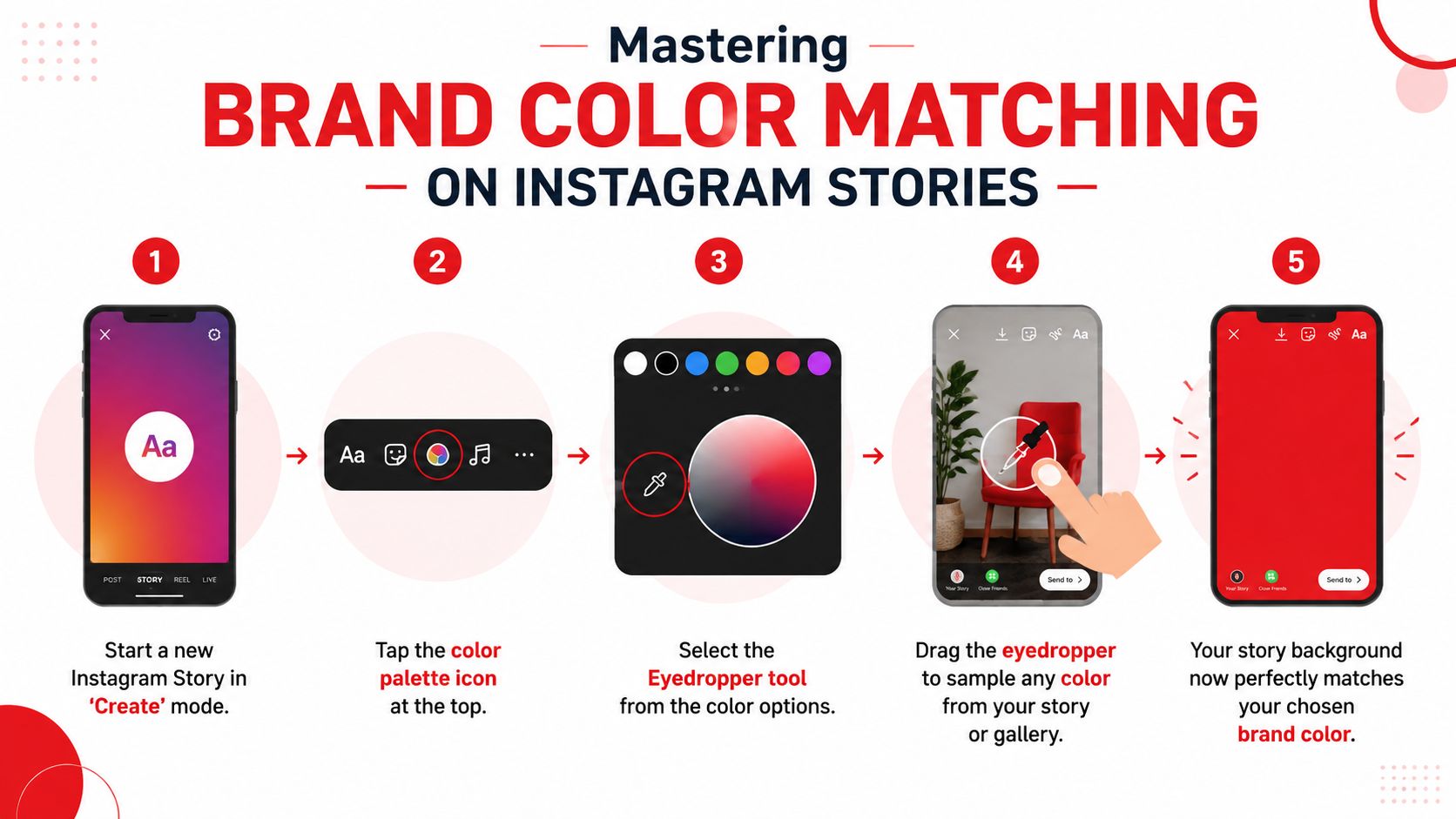
Preset colors are fine for casual Stories. They're not good enough when brand consistency matters. If you need the background to match your site, logo, product packaging, or thumbnail system, use the eyedropper workflow.
The Draw tool's eyedropper, when used with a screenshot of a brand's color palette, yields a 100% brand match (Tailwind). That same source also notes that 40% of users miss the step of importing a placeholder photo first, which limits them to preset gradients, and that long-pressing for 2-3 seconds ensures a full fill.
The exact workflow that works
Here's the cleanest version of the process:
- Take a screenshot of your brand palette, logo, website header, or style guide.
- Start a Story and import a photo or placeholder image so the full canvas is available.
- Open Draw and choose the Pen tool.
- Tap the eyedropper and drag it over the exact color in your screenshot or media.
- Once the right shade is selected, long-press the screen for 2-3 seconds to fill the background.
- Remove or hide the palette screenshot if you used it as a visible layer.
Why this beats guessing
Brand drift usually happens in small ways. One Story uses a bright red. The next one uses a muted coral. The next uses a pinkish preset because it was “close enough.” Individually, none of those seem serious. Together, they make the account feel inconsistent.
The eyedropper fixes that. It also gives you a better workflow for teams. Instead of telling someone to “pick the red we usually use,” you can tell them to sample from the saved palette screenshot every time.
Workflow note: Save one simple image with your approved brand colors in your camera roll. That turns color matching into a repeatable habit.
If your visual style leans softer, studying curated palette references can help before you sample and build. A muted palette collection via Postbae is a useful starting point for choosing combinations that feel controlled instead of loud.
This also works best when your Story colors match the rest of your identity. If you haven't documented that yet, a solid social media branding guide helps define what colors should repeat across platforms.
Creator Pro-Tips for Standout Story Backgrounds
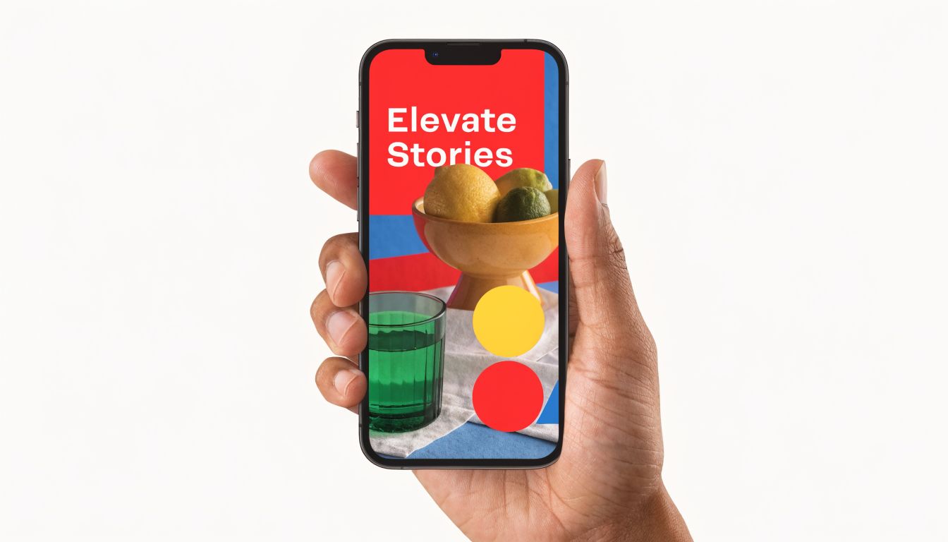
Once the background color is under control, the quality jump usually comes from details most tutorials skip. The biggest one is accessibility. The second is how you use layering instead of flat fills. The third is knowing when to leave Instagram's native palette behind.
Accessibility matters more than aesthetics
A beautiful Story that's hard to read is still a bad Story. A Hootsuite study showed that accessible Stories with proper color contrast boost view completion by 22%, and Instagram's color picker has no built-in checker (Picsart). That's why contrast checks matter, especially when you use pale brand colors, gradients, or tinted overlays.
In practice, the issue is simple. Light text on a light beige background looks refined in theory and weak on a phone screen. The same goes for thin white text on busy image fills.
A simple contrast checklist
Before posting, check these:
- Text against background: If you have to squint, viewers will too.
- Sticker visibility: Polls, links, and question boxes need space around them.
- Small-screen clarity: What looks fine on a large phone may fail on a smaller one.
- Background texture: Even a nice photo can become visual noise under text.
Don't judge contrast from the editor alone. Preview the Story as if you're a follower tapping through quickly.
The Eraser tool is better than most people use it
The Eraser tool isn't just for fixing mistakes. It's useful for controlled reveals. Fill the Story with a solid color first, then erase selective areas to expose parts of the image underneath. That creates depth without forcing a full-photo background.
Good uses for Eraser include:
- Product spotlights: Reveal only the product while keeping the rest of the frame clean.
- Text framing: Erase a narrow band or shape behind a headline.
- Layered storytelling: Expose one visual detail and leave the rest subdued.
That approach works especially well when the original image is busy but still worth showing. Instead of choosing between full image and full color fill, you get both.
Use imported gradients when presets feel limiting
Instagram's built-in gradients are fine for quick posts. They're not flexible enough for many brand systems. A better move is to create or save a custom gradient outside the app, then import it as a background image.
That gives you more control over tone, saturation, and mood. It also helps when your content style needs a recurring visual treatment, like a weekly update series, quote card, or product teaser format.
A practical workflow is:
- Build a few approved gradient backgrounds in your preferred design app.
- Save them to your camera roll in Story size.
- Import them as the first layer.
- Add text, reposts, stickers, or screenshots on top.
This keeps the visual quality high without slowing the publishing process down every day.
Making Custom Backgrounds Part of Your Workflow
The best method depends on the job. Create mode is the speed play for text-only Stories. Draw fill is the workhorse for photos, reposts, and simple layouts. Eyedropper plus Draw is the one to use when the color has to match exactly.
The mistake isn't using the wrong feature once. The mistake is treating Story backgrounds like an afterthought every time. Small design choices repeated daily become part of how people recognize your account. They also make your content look more deliberate, which matters when you're trying to build trust with an audience that sees dozens of Stories in a row.
A simple way to lock this in is to save a few reusable assets. Keep a brand palette screenshot, a couple of approved gradient backgrounds, and a short list of default Story templates in your camera roll. Pair that with a reliable editing stack from this guide to the best apps for content creation, and the whole process gets much faster.
Consistency usually looks like small discipline, repeated often.
If you're building faceless channels or scaling monetized social assets, MonetizedProfiles offers monetization-approved accounts that let creators start with a stronger foundation. It's a practical option for teams that want to move faster without sacrificing quality, branding, or revenue readiness.